Blue Glow Image
Banner Inner After
Techlusion Logo

Tailwind CSS: 10 Time-Saving Tricks You Need to Know

This guide explores 10 powerful techniques to help you maximize Tailwind CSS, streamline your custom web application development, and create responsive designs effortlessly. By implementing these strategies, you’ll cut down development time, improve maintainability, and enhance user experience.

Published Mar 06, 2025 • 5 min read

Post Feature Image
In modern web development, speed, efficiency, and maintainability are key. That’s where Tailwind CSS comes in. This utility-first CSS framework has revolutionized the way developers build sleek, responsive, and performance-optimized web applications. Whether you’re a seasoned frontend developer or just getting started, mastering Tailwind CSS can significantly improve your workflow. 

1. Make Your Styles Reusable with @apply

Instead of repeating utility classes across multiple elements, use @apply to create reusable styles:

1. Make Your Styles Reusable with @apply
css
/* styles.css */
.btn-primary {
@apply bg-blue-500 text-white font-bold py-2 px-4 rounded;
}
html
<button class=”btn-primary”>Click</button>

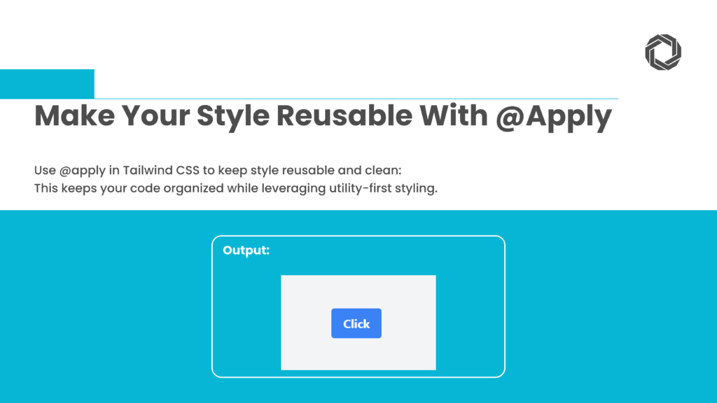
This keeps your Tailwind CSS code clean while maintaining the flexibility of utility-first styling.

2. Master Responsive Design with Ease

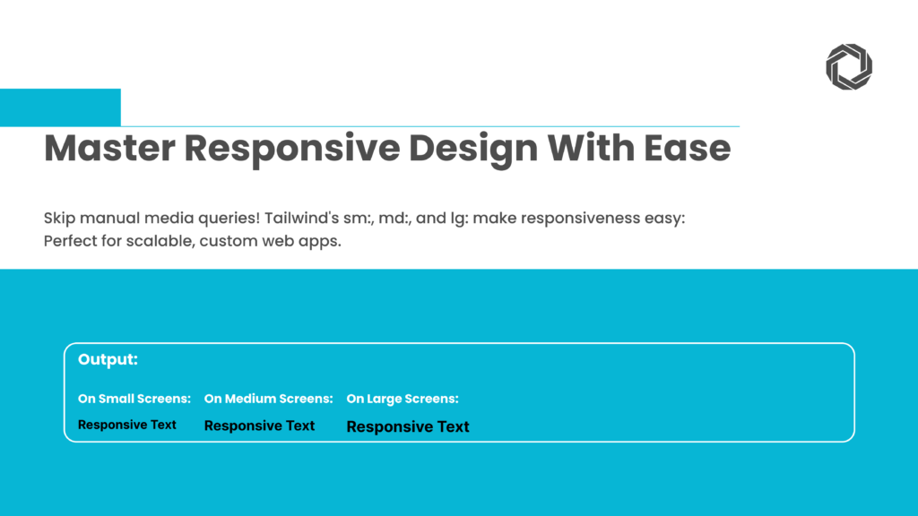
Forget about writing manual media queries. Tailwind CSS offers built-in responsive prefixes like sm:, md:, and lg: to simplify responsive design.

2. Master Responsive Design with Ease

html
<div class=”text-base md:text-lg lg:text-xl”>Responsive Text</div> 
This ensures content scales perfectly across different devices, a critical feature in custom web applications development.

3. Effortless Dark Mode Implementation

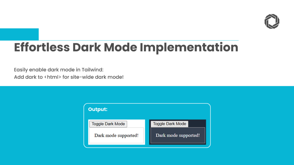
With Tailwind CSS dark mode, switching between light and dark themes is easy.

3. Effortless Dark Mode Implementation

html
<div class=”bg-white dark:bg-gray-800 text-black dark:text-white p-4″>
Dark mode supported!
</div>

Enable dark mode in tailwind.config.js:

js
module.exports = {
darkMode: ‘class’,

Now, adding dark to the <html> tag activates dark mode site-wide.


4. Style Nested Elements with group

Using the group utility, you can style child elements dynamically based on the parent state.

4. Style Nested Elements with group

html
<div class=”group p-4 border hover:bg-gray-100″>
<p class=”text-gray-600 group-hover:text-gray-900″>Hover over me!</p>
</div>

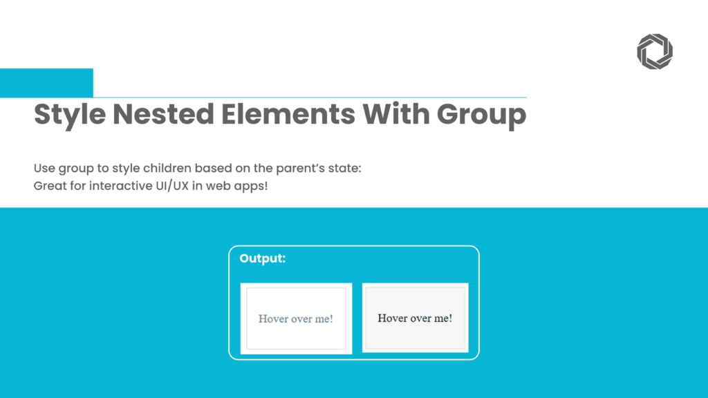
This technique is useful for interactive custom web application development, providing better UI/UX experiences.

5. Keep Embeds Responsive with aspect-ratio

Ensure iframes, images, and videos maintain the correct aspect ratio with aspect-ratio utilities. 

5. Keep Embeds Responsive with aspect-ratio

html
<div class=”w-full max-w-md aspect-video bg-gray-300″>  
Responsive Video Placeholder
</div> 

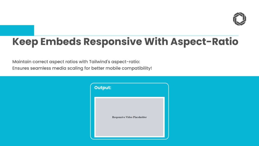
This guarantees media elements fit seamlessly within their containers, enhancing mobile compatibility. 

6. Customize with @layer

Extend Tailwind CSS by adding custom styles with @layer in tailwind.config.js.

6. Customize with @layer

js
module.exports = {
theme: {
extend: {
colors: {
brand: ‘#1DB954’,
},
},
},
}

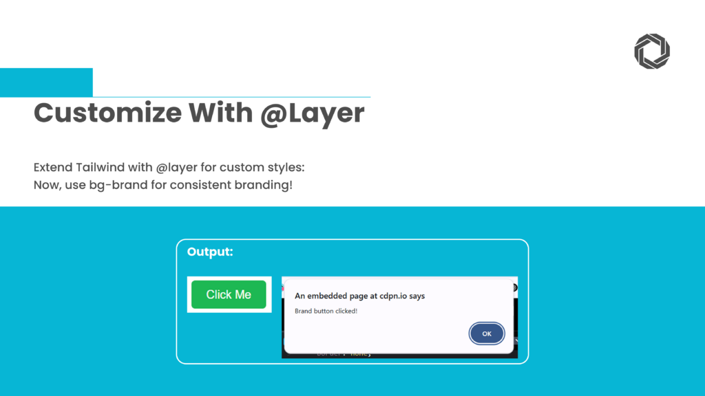
Now, you can use bg-brand anywhere in your project for consistent branding.


7. Maintain Spacing Consistency with space-x- and space-y-

Ensure uniform spacing between elements using space-x- and space-y-. 

7. Maintain Spacing Consistency with space-x- and space-y-

html
<div class=”flex space-x-4″>
  <div class=”bg-blue-500 w-10 h-10″></div>
  <div class=”bg-green-500 w-10 h-10″></div>
</div

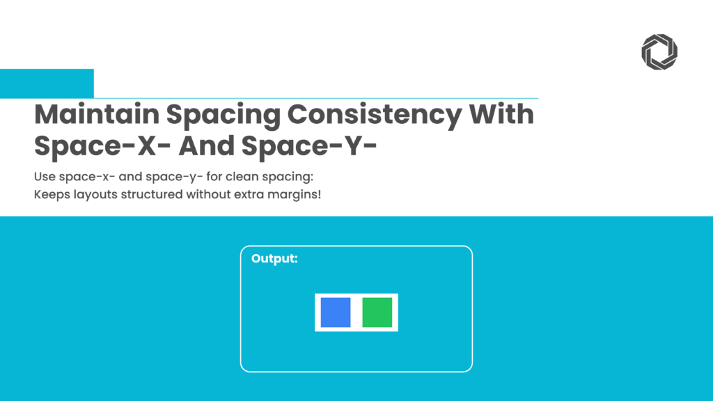
These utilities help maintain spacing without unnecessary margins, keeping your custom web applications development clean and structured.

8. Control Layouts with grid-cols-

Create dynamic layouts with the grid-cols- utility. Tailwind makes grid-based designs simple and flexible.

8. Control Layouts with grid-cols-

html
<div class=”grid grid-cols-1 sm:grid-cols-2 md:grid-cols-3 lg:grid-cols-4 gap-4″>
<div class=”bg-gray-200 p-4″>1</div>
<div class=”bg-gray-300 p-4″>2</div>
<div class=”bg-gray-400 p-4″>3</div>
<div class=”bg-gray-500 p-4″>4</div>
</div>

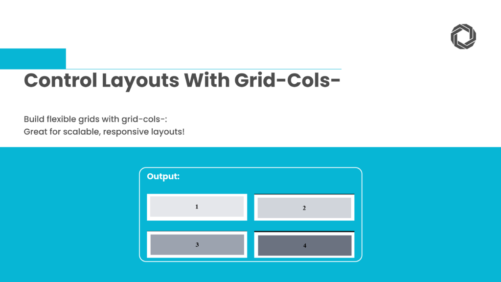
This approach is perfect for scalable, responsive custom web applications.

9. Add Motion with Tailwind Animations

Enhance user interactions with Tailwind CSS animations like animate-bounce and animate-spin.

9. Add Motion with Tailwind Animations

html
<div class=”w-10 h-10 bg-blue-500 animate-bounce”></div>

For custom animations, define them in tailwind.config.js:

js
module.exports = {
theme: {
extend: {
animation: {
wiggle: ‘wiggle 1s ease-in-out infinite’,
},
keyframes: {
wiggle: {
‘0%, 100%’: { transform: ‘rotate(-3deg)’ },
‘50%’: { transform: ‘rotate(3deg)’ },
},
},
},
},

Now, apply the animation:

html
<div class=”animate-wiggle”>Animated Element</div> 

Adding motion increases engagement, making your UI feel more interactive.


10. Keep CSS Files Lightweight with PurgeCSS

Reduce unused CSS for better performance. Tailwind CSS automatically purges unused styles in production.

10. Keep CSS Files Lightweight with PurgeCSS

Configure tailwind.config.js:

js
module.exports = {
purge: [‘./src/**/*.{js,jsx,ts,tsx,html}’],
}

This keeps CSS files lean, ensuring fast load times for custom web applications development.

Final Thoughts

Tailwind CSS is a game-changer for modern web development. By leveraging these techniques, you can speed up workflows, maintain code consistency, and enhance UI design.

At Techlusion, we specialize in custom web application development, ensuring businesses harness the full potential of modern frontend frameworks like Tailwind CSS. Whether you’re building a SaaS product, an eCommerce site, or an enterprise-grade solution, our expertise in custom web application development services ensures scalable and high-performing digital experiences. 

Final Thoughts

Related Reading: 

📖 Learn how to Develop an App for Android and iOS : A Comprehensive Guide.